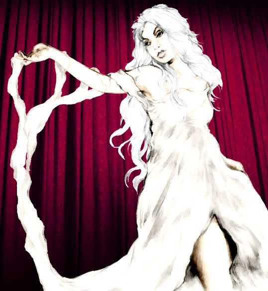
While you're all busy ordering your copy of Outcastes #5 (hint), I made a start on next issue's cover. Following the last cover's simple composition, I fancied a challenge and threw the proverbial kitchen sink at this new one. The basic idea was to emulate the style of a vintage magic poster, with various arcanery floating around behind the foreground figures.
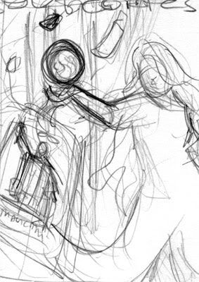
After this rough thumbnail I pencilled the three main elements separately to composite and filter later. Surely the dullest thing I've ever had to draw, the curtains were done from reference, whereas the magician's pose was loosely based on this Thurston poster below.
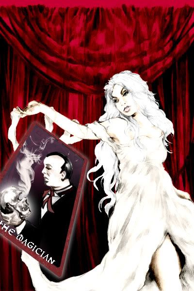
I tried to stick to a red and white colour scheme, colouring in my usual flats and layers manner. Astraea's dress started off gold, but blue seemed more in keeping with the final image. The cards were done in a Tarot style. For the smaller two in the background I ended up tracing and colouring two cards I'd inked in #2. The crystal ball was straightforward, just using the circle tool and a few white radial gradients for the highlights. I warped the curtain background behind it to make it appear spherical where it shines through. I gave the cards, ball and skull a glow effect, something I'm usually loath to use, but necessary for this particular image.
Finally I pasted on a couple of star patterned brushes in the background. I always try to draw these things myself from reference, like the pentagram on #2's cover, but in this case there's no way I could replicate that same soft glow in pencil. It's a minor cheat but I think it really sets the whole image off, without becoming too over-busy.
So job done, just got to draw a comic to go with it now...
