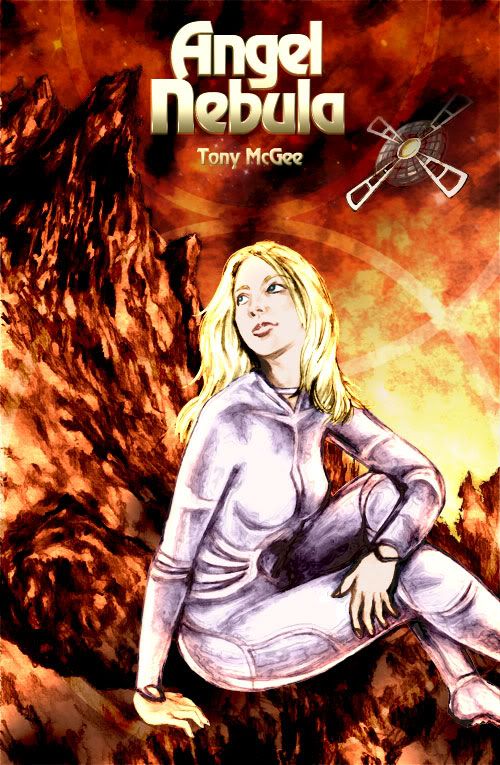
It's long been an aim of mine to collect my earlier 3 series into proper handsome books, something which has become feasible with the advent of affordable print on demand services. So I figured it's about time I got cracking on that daunting task of scanning and cleaning up 500 or so pages of old artwork. I already did a nice cover for a Dark Weather collection, and an acceptable Frontiers one, so now it's the turn of Angel Nebula to receive the colour cover makeover treatment. I'm often asked how I put these things together, so time for a tutorial, which will probably take me longer to explain than it did to colour the image...
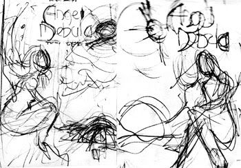 I always liked that sketch of Thena sitting on Mars looking up, so that became the focus for the thumbnails. I planned to include the greenhouse in the background, but in the end there just wasn't enough room.
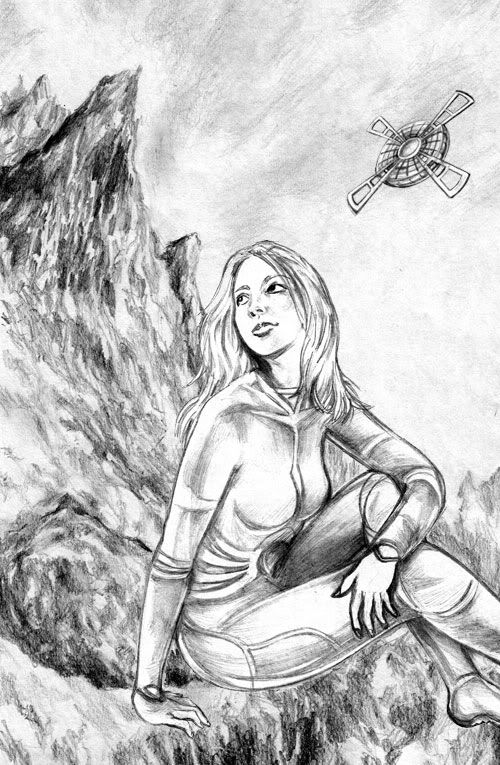 So I pencil shaded the 3 elements separately, Thena and the ship with a H, and the Mars landscape with a 2B. Then I composited them on computer, positioning and resizing the foreground elements to fit.
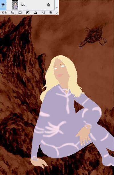 Next step is to separate Thena from the white background using the magic wand tool. I then went in and cleaned up the outline, then filled a Flats layer underneath with a light purple. Then I go in and paint over the details like the skin, hair, highlights etc. Left you can see what the Flats layer looks like without the pencils overlayed.
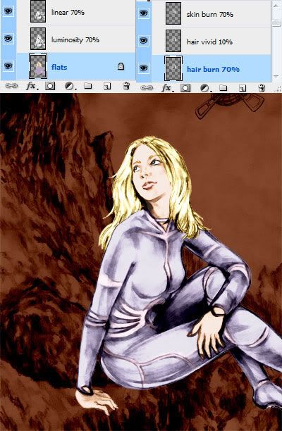 Now the fun part, adding on pencil layers. Much of this is trial and error, playing with the Layer mode box and Opacity slider to see what works and what doesn't. First I filter the pencils to smooth out the rough edges, without losing any clarity. I usually set the first pencil layer to Luminosity mode at around 70%, which lets the flat colours underneath shine through. Then I duplicate that layer and change the mode to Linear Burn, anywhere from 30 to 100%. This darkens up the pencil outlines and the overall contrast. I then copy just the hair and skin pencils to a 5-15% Vivid Light layer, to add a bit of shine and a healthy glow. Here I've also added Color Burns at 70% to enrich the skin and hair tones.
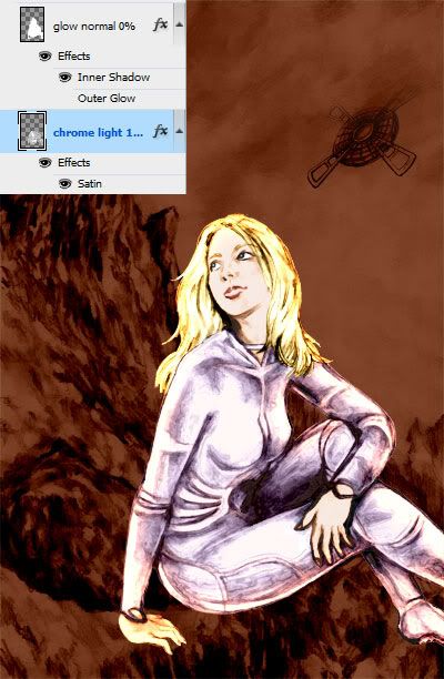 To blend Thena into the dark red background, I finished off with a couple of special effects layers using the Blending Options. I gave Thena's spacesuit more of a metallic finish with the Sketch > Chrome filter. The Satin and Inner Shadow blending were set to red and purple, to give Thena's outline a warm glowy ReadyBrek look.
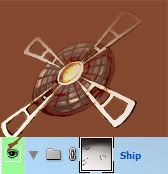 To cut a long story shorter, the ship was coloured in much the same way. These days I tend to group layers together, so I can turn on and off different elements, like the ship here. The other advantage of that is applying a Layer Mask to a group. You can paint black on these to erase on all the layers grouped underneath. But the real beauty is using black to transparent gradients to fade objects into the background, like the ship here.
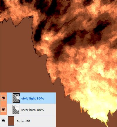
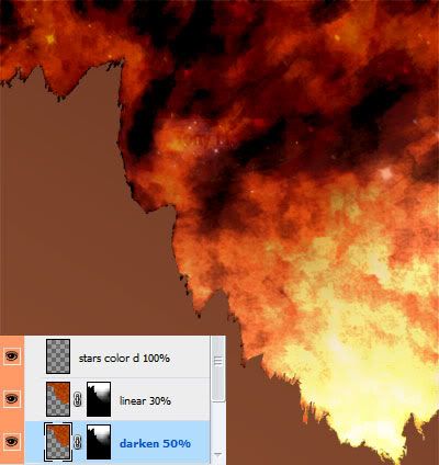 So onto that background at last. The sky was sketched very lightly, so I used Levels to bump up the contrast to give it a stormy look. The Vivid Light layer here over a dark brown background really brings out the light and shade. All that's left is to darken and enrich it with Darken and Linear Light layers respectively. I painted on a few star brushes to get that faint star effect, on a Color Dodge layer, giving a nice spectrum of white to red stars.
 In comparison with the rest of the piece, the Mars rocks were almost too easy. I set the pencils to dark 100% Linear Burn, and overlayed with 75% Vivid Light, which really brought out a great range of colours.
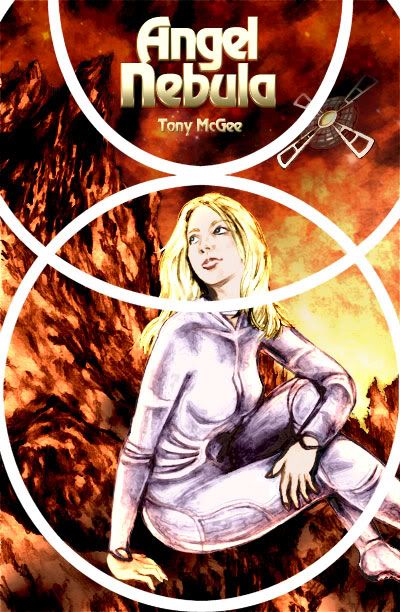 One thing I love about the Angel Nebula montage covers is the circular design, so I tried to incorporate that somehow. I basically traced over the Book 1 cover using the circle tool to get the same effect. Then I set the layer to Soft Light so it's just about visible on the final image. Add logo and 2 hours later, Bob's your uncle...